The previous post built an Airflow pipeline that fetches ECB exchange rates daily and loads them into PostgreSQL. The data is there — but querying it requires either a SQL client or writing more Python. That’s the gap Superset fills.
Apache Superset is a data exploration and visualization platform: connect it to any SQL database, define datasets, build charts, assemble dashboards. No JavaScript, no custom React components. The output is a shareable, filterable web dashboard that updates as new data arrives.
This post extends the Airflow ETL setup with Superset, builds four charts over the exchange_rates table, and explains what makes Superset’s semantic layer approach different from tools like Grafana or Metabase.
Table of contents
Open Table of contents
- What Superset is
- Adding Superset to Docker Compose
- Loading historical data
- Auto-provisioning on first launch
- Connecting to the PostgreSQL data warehouse
- The semantic layer: Datasets
- Building charts
- Assembling the dashboard
- SQL Lab for ad-hoc analysis
- Superset vs alternatives
- What the full stack looks like in production
- Related posts
What Superset is
Superset originated at Airbnb (open-sourced 2015 as “Caravel”, renamed to Superset, entered the Apache Incubator in 2017, graduated to a top-level Apache project in January 2021). The architecture is simpler than it looks:
- Backend: Flask (Python) with Flask-AppBuilder for authentication and RBAC
- Frontend: React + Apache ECharts for most modern chart types (deck.gl for geospatial, AG-Grid for pivot tables)
- Metadata store: Any SQLAlchemy DB (SQLite for local dev, PostgreSQL for production)
- Data source: Any SQLAlchemy-compatible database — PostgreSQL, MySQL, BigQuery, Snowflake, ClickHouse, DuckDB, and 30+ more
Superset does not store or cache your data. It executes SQL queries against your database at query time and renders the results. The metadata it stores is configuration only: chart definitions, dashboard layouts, dataset schemas, user settings.
The three-layer stack
┌─────────────────────────────────────────────────────────────┐│ Apache Superset ││ Dashboards · Charts · SQL Lab · Semantic layer ││ (visualization) │└─────────────────────────────┬───────────────────────────────┘ │ SQL queries at runtime┌─────────────────────────────▼───────────────────────────────┐│ PostgreSQL (data warehouse) ││ exchange_rates table — date, currency_pair, rate ││ (storage) │└─────────────────────────────┬───────────────────────────────┘ │ INSERT … ON CONFLICT┌─────────────────────────────▼───────────────────────────────┐│ Apache Airflow ││ ecb_exchange_rates_etl DAG — daily at 08:00 UTC ││ (orchestration) │└─────────────────────────────────────────────────────────────┘Airflow is the scheduler, PostgreSQL is the source of truth, Superset is the read layer. Each component has one responsibility.
Adding Superset to Docker Compose
Extend the docker-compose.yml from the Airflow post with two new services. The existing airflow-postgres and data-warehouse services are unchanged.
# Add to the existing docker-compose.yml
  # Superset init: runs migrations and creates the admin user, then exits  superset-init:    image: apache/superset:3.1.0-dev       # -dev variant bundles common DB drivers (psycopg2, mysql, redis…)    entrypoint: /bin/bash    command:      - -c      - |        superset db upgrade && \        superset fab create-admin \          --username admin \          --password admin \          --firstname Admin \          --lastname User \          --email admin@superset.local && \        superset init    environment:      SUPERSET_SECRET_KEY: 'replace_this_with_a_64_char_random_string_for_production'    volumes:      - superset-home:/app/superset_home    depends_on:      data-warehouse:        condition: service_healthy
  superset-webserver:    image: apache/superset:3.1.0-dev       # must match the init image    # No custom `command:` — let the image's default run-server.sh launch gunicorn    ports:      - "8088:8088"    environment:      SUPERSET_SECRET_KEY: 'replace_this_with_a_64_char_random_string_for_production'    volumes:      - superset-home:/app/superset_home    depends_on:      superset-init:        condition: service_completed_successfully    healthcheck:      test: ["CMD", "curl", "--fail", "http://localhost:8088/health"]      interval: 30s      timeout: 10s      retries: 5
volumes:  superset-home:
The -dev image tag ships with the PostgreSQL, MySQL, and Redis drivers already installed, so no pip install step is needed. The lean apache/superset:3.1.0 tag does not include psycopg2-binary — attempting to connect to PostgreSQL from that image will fail with ModuleNotFoundError: No module named 'psycopg2'.
Apply:
docker compose up -d superset-init    # waits for init to completedocker compose up -d superset-webserver
# Open http://localhost:8088 — login: admin / admin
Running alongside the other Airflow projects: the companion
superset-airflow-ecbproject uses shifted ports so it can coexist with the standalone v2 (airflow-etl-ecb) and v3 (airflow-etl-ecb-v3) projects on the same Docker host. Airflow UI is on 8081 (not 8080), the data warehouse is on 5435 (not 5433), and Superset stays on 8088. See the Airflow v2→v3 migration post for the full port table and commands for all three stacks.
Init takes 4–7 minutes on first run — Alembic runs ~70 migrations on the fresh metadata DB and superset init creates all default roles and permissions.
Secret key:
SUPERSET_SECRET_KEYencrypts Flask sessions. If you change it, all existing sessions are invalidated. Generate a production key with:python -c "import secrets; print(secrets.token_hex(32))". Never commit the real value to git.
Loading historical data
Before building dashboards, you need data in the warehouse. The Airflow DAG runs daily going forward, but for the charts below we want exchange rate history from 1 January to 19 April 2026 — 77 trading days across three currency pairs, yielding up to 231 rows in PostgreSQL.
Running the backfill
Airflow’s dags backfill command replays the DAG for every day in a date range, just as if the scheduler had triggered it on each of those dates. First unpause the DAG so Airflow schedules it, then kick off the backfill:
# 1. Unpause the DAG (required before backfill will run it)docker compose exec -T airflow-scheduler \  airflow dags unpause ecb_exchange_rates_etl
# 2. Run the backfilldocker compose exec -T airflow-scheduler \  airflow dags backfill \    --start-date "2026-01-01" \    --end-date   "2026-04-19" \    --yes \    ecb_exchange_rates_etl
Breaking down the command:
| Part | What it does |
|---|---|
docker compose exec -T airflow-scheduler | Runs the following command inside the running airflow-scheduler container. -T disables pseudo-TTY allocation — needed when running non-interactively (CI, scripts). |
airflow dags backfill | Airflow CLI sub-command that triggers historical DAG runs. |
--start-date "2026-01-01" | First logical date to process. Airflow creates one DAG run per scheduled interval starting here. |
--end-date "2026-04-19" | Last logical date to process (inclusive). Combined with the DAG’s 0 8 * * 1-5 schedule, this produces 77 weekday runs. |
--yes | Skips the interactive confirmation prompt (Are you sure? [y/N]). Required when running non-interactively. |
ecb_exchange_rates_etl | The dag_id to backfill. Must match exactly what’s in the @dag(dag_id=...) decorator. |
Parallel execution with max_active_runs=5
By default, the DAG ships with max_active_runs=1, which processes one date at a time. For a large historical backfill that’s unnecessarily slow — the ECB API is stateless and each date is independent. Set max_active_runs=5 in the @dag decorator to allow five dates to run concurrently:
@dag( dag_id="ecb_exchange_rates_etl", max_active_runs=5, # 5 dates run in parallel during backfill ...)With max_active_runs=5, Airflow runs five DAG instances simultaneously, each fetching three currencies in parallel inside them. That’s up to 15 concurrent ECB API calls — well within the public API’s limits at this scale. The upsert (ON CONFLICT DO UPDATE) makes it safe to replay any date multiple times without duplicates, so there’s no correctness risk from parallelism.
Effect on backfill time:
max_active_runs | Approx. time for 77 runs |
|---|---|
| 1 (default) | ~50 minutes |
| 5 | ~10–12 minutes |
Airflow re-parses DAG files every 30 seconds, so you can change max_active_runs while the backfill is already running — the new limit takes effect on the next scheduling cycle without needing a restart.
The animation below shows five DAG runs advancing simultaneously in Airflow’s grid view — each column is one date, each row is one task, and you can see create_table → fetch_* → load_* → verify_load completing in waves across five dates at once:
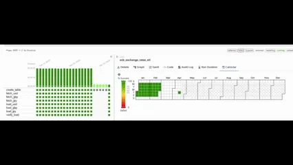
Backfill results
After completion the scheduler logs:
[backfill progress] | finished run 77 of 77 | tasks waiting: 0| succeeded: 616 | running: 0 | failed: 0 | skipped: 0616 tasks across 77 runs: each DAG run has 8 tasks (create_table, fetch_usd, fetch_gbp, fetch_jpy, load_usd, load_gbp, load_jpy, verify_load) → 77 × 8 = 616. Zero failures, zero retries needed.
The calendar view in Airflow confirms every weekday from January to April shows 100% green:
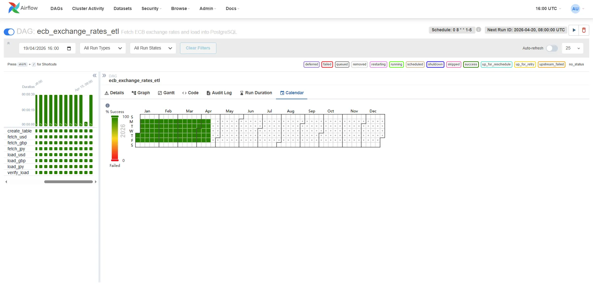
The left panel shows the task breakdown — all eight tasks green for every run. The calendar heatmap on the right shows Jan–Apr weekdays fully covered, with weekends correctly left empty (the DAG schedule is 0 8 * * 1-5).
Verifying the data
psql -h localhost -p 5435 -U warehouse -d rates_db \ -c "SELECT currency_pair, COUNT(*) AS days, MIN(date), MAX(date) FROM exchange_rates GROUP BY 1 ORDER BY 1;"Expected output:
currency_pair | days | min | max---------------+------+------------+------------ GBP/EUR | 75 | 2026-01-02 | 2026-04-17 JPY/EUR | 75 | 2026-01-02 | 2026-04-17 USD/EUR | 75 | 2026-01-02 | 2026-04-1775 rows per currency (not 77) because the ECB did not publish on 1 January (New Year’s Day) and 3 April (Good Friday 2026). The DAG’s verify_load task treats zero-record days as expected non-publishing days and logs a warning rather than failing the run — a true API outage would raise an exception inside fetch_rates instead.
Auto-provisioning on first launch
Rather than clicking through the UI on every fresh container start, the companion project includes a bootstrap script that runs automatically as part of superset-init. When you run docker compose up -d for the first time, Superset creates the database connection, dataset, chart, and dashboard without any manual steps.
The init sequence in docker-compose.yml:
superset-init: command: - -c - | superset db upgrade && superset fab create-admin ... && superset init && python /app/bootstrap/bootstrap.py # ← provisions assets volumes: - superset-home:/app/superset_home - ./superset-init:/app/bootstrap # ← mounts the scriptThe script (superset-init/bootstrap.py) uses Superset’s internal ORM directly — the same mechanism Superset uses for its own load_examples command. It creates six objects in sequence:
[1/6] Database connection → ECB Data Warehouse (PostgreSQL)[2/6] Dataset → exchange_rates (raw table)[3/6] Virtual dataset → exchange_rates_indexed (SQL — base-100 rebased)[4/6] Chart A → Currency Rate Evolution Jan–Apr 2026[5/6] Chart B → Currency Strength Index — Base 100 (Jan 2026)[6/6] Dashboard → ECB Exchange Rates Monitor (both charts)Each step is idempotent: if the object already exists by name it is skipped, so restarting the init container is safe.
Why explicit column definitions instead of introspection
The virtual dataset (exchange_rates_indexed) always gets its four columns (date, currency_pair, indexed_rate, raw_rate) written directly by the bootstrap script, without querying the live warehouse. This avoids the “Columns missing in dataset” error that occurs when fetch_metadata() is called before the backfill has populated the exchange_rates table. The raw dataset uses introspection for convenience since its schema is static, but the virtual dataset’s columns are deterministic — we wrote the SQL, so we know the output columns.
After the init container exits successfully, the webserver starts — open http://localhost:8088/superset/dashboard/ecb-exchange-rates/ and the dashboard with both charts is already there. The charts show “No data” until you run the backfill, then they populate automatically on the next query.
If you see “Columns missing in dataset” on an existing installation (e.g., you had an earlier version of the bootstrap without explicit columns): go to Datasets → exchange_rates_indexed → Edit (pencil icon) → Columns tab → Sync columns from source, then save. The chart will work immediately after.
Connecting to the PostgreSQL data warehouse
The bootstrap script creates the connection automatically. If you ever need to add it manually (e.g. after wiping Superset’s metadata volume), the settings are:
- Click the gear icon (top right) → Settings → Database Connections → + DATABASE
- Select PostgreSQL from the database type picker
- Fill in the connection details:
- Host:
data-warehouse(Docker service name — Superset runs in the same Docker network) - Port:
5432 - Database name:
rates_db - Username:
warehouse - Password:
warehouse
- Host:
- Click Test Connection — it should say “Connection looks good!”
- Save as ECB Data Warehouse
The connection URI Superset stores internally:
postgresql://warehouse:warehouse@data-warehouse:5432/rates_dbThis is identical to what Airflow’s data_warehouse connection points to — same database, two consumers.
The semantic layer: Datasets
In Superset, you don’t query tables directly in charts. You first define a Dataset — a reusable abstraction over a table, view, or SQL expression. Charts are built on top of datasets, not raw tables.
Why the indirection?
- Shared metrics: Define
pct_change = (rate - LAG(rate) OVER (...)) / LAG(rate) OVER (...)once in the dataset, reuse it in ten charts without repeating the window function. - Column labels: Rename
currency_pairtoCurrencyin the dataset so every chart gets the friendly label automatically. - Certified datasets: Mark a dataset as “certified” to signal to your team that it’s the authorised source for that data — a lightweight governance mechanism.
Create the dataset:
- Datasets → + Dataset
- Database: ECB Data Warehouse
- Schema: public
- Table: exchange_rates
- Click Create Dataset and Create Chart (or just Save)
Superset introspects the table schema and creates column definitions. You can then edit the dataset to:
- Add calculated columns (e.g.,
date_trunc('week', date) AS week_start) - Add metrics (pre-aggregated expressions like
AVG(rate),MAX(rate)) - Set the main datetime column (
date) for time-based filtering across the dashboard
Building charts
Chart 1: Currency rate evolution — Jan to Apr 2026 (featured chart)
This is the main chart for the dashboard: three lines showing how USD/EUR, GBP/EUR, and JPY/EUR evolved across the full backfilled period. Here’s the exact configuration to reproduce it:
- Charts → + Chart
- Dataset:
exchange_rates| Chart type: Line Chart - In the Data tab, configure:
| Field | Value | Why |
|---|---|---|
| X-AXIS | date | One point per trading day on the horizontal axis |
| METRICS | AVG(rate) | One rate per day per currency — AVG aggregates cleanly |
| DIMENSIONS | currency_pair | Splits the single query into one line per currency |
| TIME RANGE | Custom → 2026-01-01 to 2026-04-19 | Pins the chart to the backfilled period |
| SORT BY | date ascending | Left-to-right chronological order |
-
In the Customize tab:
- Chart Title:
ECB Exchange Rates — Jan to Apr 2026 - Show Legend: enabled
- X Axis Title:
Date - Y Axis Title:
Rate (vs EUR)
- Chart Title:
-
Click Run Query to preview, then Save as Currency Rate Evolution Jan–Apr 2026
Y-axis scale note: USD/EUR hovers around 0.90–1.05 while JPY/EUR sits at 155–165 — all three share a single Y-axis by default, which compresses the USD and GBP lines. Two options: add a
currency_pair IN ('USD/EUR', 'GBP/EUR')filter to focus on the two comparable rates, or build a Mixed Chart with a secondary Y-axis for JPY. For a first dashboard the three-line version is fine as a trend overview.
The SQL Superset generates (visible under ⋮ → View Query):
SELECT date AS date, currency_pair, AVG(rate) AS "AVG(rate)"FROM exchange_ratesWHERE currency_pair IS NOT NULL AND date >= '2026-01-01' AND date < '2026-04-20'GROUP BY date, currency_pairORDER BY date ASCLIMIT 50000;This query hits 225 rows (75 days × 3 currencies) and returns in under 10ms on the local PostgreSQL instance. At production scale with millions of rows you’d add a partial index on date or pre-aggregate into a materialised view — but for this dataset the raw table is fast enough.
The screenshot below shows the chart builder with the exact configuration above — X-axis set to date, metric AVG(rate), dimension currency_pair, and the date filter 2026-01-01 ≤ date < 2026-04-20. Note how USD/EUR (~0.85) and GBP/EUR (~0.85) are grouped near the bottom while JPY/EUR (~1.2 after EUR inversion — displayed here as the reciprocal) sits higher, which is precisely the Y-axis scale problem that Chart 2 solves:
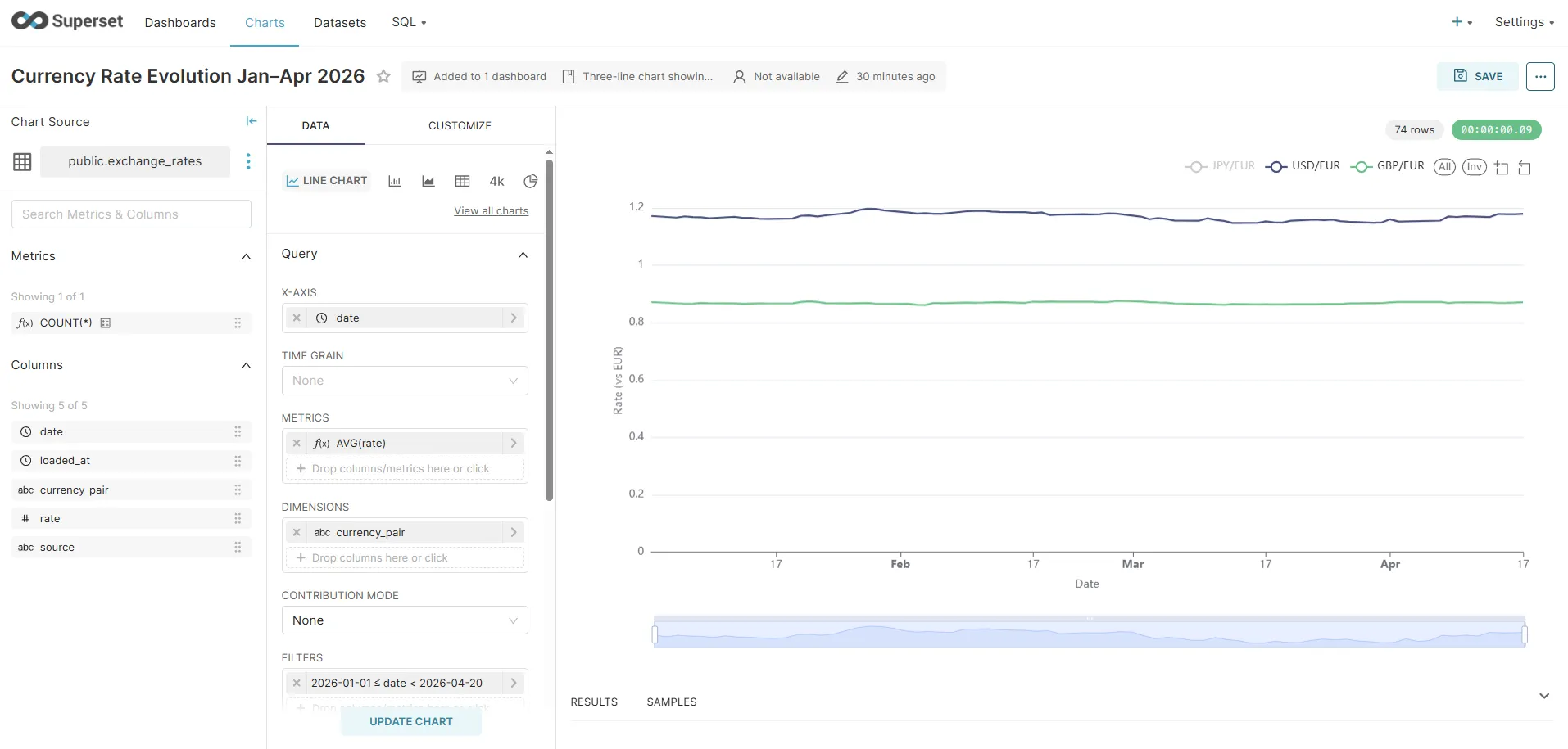
Chart 2: Currency Strength Index — Base 100 (the insight chart)
The absolute chart has a fundamental visualisation problem: JPY/EUR sits at ~160 while USD/EUR and GBP/EUR sit around 0.90–1.05. All three share the same Y-axis, so USD and GBP become flat lines crushed to the bottom of the plot — any movement in them is invisible next to JPY’s scale.
The standard solution in financial journalism (Bloomberg, FT, Reuters) is to rebase all series to 100 on the first trading day. Every currency starts at exactly 100, and the Y-axis shows percentage deviation from that baseline. A value of 103 means “3% stronger vs EUR than on day one”; 97 means “3% weaker”. The absolute magnitudes disappear, and the relative trends become directly comparable.
Step 1 — Create the Virtual Dataset
A Virtual Dataset is a SQL query that Superset treats like a table. It lives in Superset’s metadata, not the database.
- Datasets → + Dataset
- Select database: ECB Data Warehouse | switch to VIEW AS SQL
- Paste the following query and name it
exchange_rates_indexed:
SELECT e.date, e.currency_pair, ROUND((e.rate / b.base_rate) * 100, 4) AS indexed_rate, e.rate AS raw_rateFROM exchange_rates eJOIN ( SELECT r.currency_pair, r.rate AS base_rate FROM exchange_rates r WHERE r.date = ( SELECT MIN(m.date) FROM exchange_rates m WHERE m.currency_pair = r.currency_pair )) b ON e.currency_pair = b.currency_pairORDER BY e.date, e.currency_pair- Set Main datetime column →
date - Save as exchange_rates_indexed
Why no CTEs? Superset wraps virtual dataset SQL inside
SELECT ... FROM (<your_sql>) AS virtual_table WHERE .... PostgreSQL does not allow aWITHclause inside a subquery in this position — it must appear at the top level. The subquery form above is equivalent and works correctly with Superset’s query generation.
The inner subquery picks MIN(date) per currency pair, so it automatically finds the first available trading day regardless of holidays — no hard-coded date.
Step 2 — Build the chart
- Charts → + Chart
- Dataset:
exchange_rates_indexed| Chart type: Line Chart - In the Data tab:
| Field | Value |
|---|---|
| X-AXIS | date |
| METRICS | AVG(indexed_rate) |
| DIMENSIONS | currency_pair |
| TIME RANGE | Custom → 2026-01-01 to 2026-04-19 |
-
In the Customize tab:
- Y Axis Title:
Index (first trading day = 100) - Y Axis Format:
.2f(two decimal places) - Smooth lines: enabled (normalised trend data looks cleaner with interpolation)
- Show Legend: enabled
- Y Axis Title:
-
(Optional) Add a Formula annotation at
y = 100with a dashed grey line — it makes the “above/below baseline” reading instant. -
Run query → Save as Currency Strength Index — Base 100 (Jan 2026)
The result: three smooth lines that all start at 100 on 2 January 2026 and diverge from there. A reader can immediately see which currency strengthened the most vs EUR over the period without knowing anything about JPY’s absolute exchange rate.
The SQL Superset generates:
SELECT date, currency_pair, AVG(indexed_rate) AS "AVG(indexed_rate)"FROM ( WITH base_dates AS ( ... ), base_rates AS ( ... ) SELECT e.date, e.currency_pair, ROUND((e.rate / br.base_rate) * 100, 4) AS indexed_rate, ... FROM exchange_rates e JOIN base_rates br ...) AS virtual_tableWHERE date >= '2026-01-01' AND date < '2026-04-20'GROUP BY date, currency_pairORDER BY date ASCLIMIT 50000;Auto-provisioned: the bootstrap script creates this virtual dataset and chart automatically on first container start — no manual SQL or UI steps needed.
Chart 3: Single-currency detail — USD/EUR over time
- Charts → + Chart
- Dataset:
exchange_rates| Chart type: Line Chart - Configure:
- X-axis:
date - Metrics:
AVG(rate) - Filters:
currency_pair = 'USD/EUR' - Time range: Last 90 days (or the same custom range as Chart 1 for consistency)
- X-axis:
- Run query → Save as USD/EUR Daily Rate
The chart renders as a time series line using whatever data Airflow has loaded. As new rows arrive each morning, the chart extends automatically — Superset re-queries on each dashboard load.
Chart 4: Big Number with Trendline — latest USD/EUR rate
- Charts → + Chart
- Dataset:
exchange_rates| Chart type: Big Number with Trendline - Configure:
- METRIC:
AVG(rate) - FILTERS:
currency_pair = 'USD/EUR' - TIME RANGE: Last 7 days
- METRIC:
- Run query → Save as USD/EUR Latest Rate
This renders as a large number with a small sparkline trendline below it. Note on semantics: the “big number” shown in Superset 3.x is the value of the last time bucket, not the aggregation applied across the whole range. The metric (e.g., AVG(rate)) is evaluated per time bucket and the last bucket’s value is displayed. Because our data has one rate per day per pair, the last bucket contains a single value — so AVG(rate) and MAX(rate) produce identical results here. On a dataset with multiple rows per bucket, you’d be picking the aggregation used within the final time bucket.
Chart 5: Table — latest rates for all currencies
- Charts → + Chart
- Dataset:
exchange_rates| Chart type: Table - Configure:
- Columns:
date,currency_pair,rate - Ordering:
datedescending - Row limit: 20
- Columns:
- Run query → Save as Latest Exchange Rates
Tables in Superset support conditional formatting (highlight rates above/below a threshold), column width adjustments, and pagination.
Assembling the dashboard
- Dashboards → + Dashboard
- Name it ECB Exchange Rates Monitor
- Click Edit dashboard (pencil icon)
- From the Charts panel on the right, drag your five charts onto the canvas
- Resize using the grid handles
- Add a Markdown component for descriptive text
- Click Save
Auto-provisioned:
docker compose up -dcreates the dashboard with both line charts pre-placed via the bootstrap script. The layout below matches what the script sets up.
Suggested layout:
┌─────────────────────────────────────────────┐│ Currency Strength Index — Base 100 ││ (normalised — the insight chart) │├─────────────────────────────────────────────┤│ Currency Rate Evolution Jan–Apr 2026 ││ (absolute rates — reference chart) │├────────────────────────────┬────────────────┤│ USD/EUR Latest Rate │ Latest Rates ││ (Big Number) │ (Table) │├────────────────────────────┴────────────────┤│ USD/EUR Daily Rate ││ (Single-series line chart) │└─────────────────────────────────────────────┘The indexed chart sits at the top because it carries the most analytical value: it answers “which currency moved the most?” at a glance. The absolute chart below it serves as a reference for anyone who needs the actual rate values.
Dashboard filters
Add a Date Range filter that controls all five charts simultaneously:
- In edit mode: Filters → + Add filter
- Filter type: Time range
- Scope: all charts
- Default value: Last 90 days
Now users can select “Last 30 days” or “Last year” and all charts update from a single control — Superset appends a WHERE date BETWEEN ... clause to every chart query.
Cross-filtering
Cross-filtering is enabled from the filter bar gear icon (left side of the dashboard), not a “Dashboard Settings” menu: click the gear → tick Enable cross-filtering. The underlying feature flag DASHBOARD_CROSS_FILTERS is on by default in Superset 3.x.
Once enabled, clicking a data point on the multi-series chart — say, the JPY/EUR line — filters all other charts on the dashboard to that currency pair. Superset injects the clicked dimension as an additional WHERE clause in the affected charts’ queries. No code required.
SQL Lab for ad-hoc analysis
Superset includes a full SQL editor (SQL Lab) connected to any of your registered databases. Use it for investigations that don’t warrant a permanent chart:
-- 30-day rolling average vs spot rateSELECT date, currency_pair, rate AS spot_rate, AVG(rate) OVER ( PARTITION BY currency_pair ORDER BY date ROWS BETWEEN 29 PRECEDING AND CURRENT ROW ) AS rate_30d_avg, rate - AVG(rate) OVER ( PARTITION BY currency_pair ORDER BY date ROWS BETWEEN 29 PRECEDING AND CURRENT ROW ) AS deviation_from_avgFROM exchange_ratesWHERE date >= CURRENT_DATE - INTERVAL '90 days'ORDER BY date DESC, currency_pair;SQL Lab results can be:
- Saved as a chart directly (click Explore → Chart)
- Exported as CSV for further analysis
- Saved as a named query and shared with teammates
- Promoted to a Virtual Dataset — a SQL-defined view that becomes available to the chart builder like a regular table
The Virtual Dataset feature is particularly useful when your chart logic is too complex for the no-code builder: write the SQL once in SQL Lab, save it as a virtual dataset, and the chart builder treats it like a regular table.
Superset vs alternatives
| Superset | Grafana | Metabase | Redash | |
|---|---|---|---|---|
| Primary use | BI dashboards + exploration | Time series monitoring | BI (non-technical users) | SQL-first analytics |
| SQL editor | Yes (SQL Lab) | Limited | Yes | Yes (primary interface) |
| Semantic layer | Yes (datasets + metrics) | No | Limited | No |
| Chart types | 40+ | ~20 (panels) | 15+ | 15+ |
| Alert/monitoring | Basic | Excellent | No | No |
| Auth / RBAC | Full (Flask-AppBuilder) | Full | Full | Full |
| Self-hosted | Yes (Apache license) | Yes (AGPL) | Yes (AGPL) | Yes (BSD) |
Choose Grafana when your data is time-series metrics from Prometheus, InfluxDB, or Loki — it has native integrations and alert evaluation that Superset lacks.
Choose Metabase when your primary users are non-technical stakeholders who need a simpler interface without a SQL editor.
Choose Superset when your team is SQL-literate, you want a semantic layer for shared metric definitions, and you’re already in the PostgreSQL/Snowflake/BigQuery ecosystem.
Redash is similar to Superset but chart-first (SQL Lab is the primary interface). It’s smaller and lighter but has less active development since being acquired by Databricks.
What the full stack looks like in production
For production (beyond local Docker Compose):
- Airflow: Helm chart on Kubernetes, CeleryExecutor with Redis, DAG files in a git repo synced via git-sync sidecar
- PostgreSQL: Managed instance (RDS, Cloud SQL, Neon) — not in a container
- Superset: Official Helm chart or Docker Compose with Redis for cache and Celery workers for async query execution, PostgreSQL as its own metadata store
The async query pattern matters when charts run heavy aggregate queries against large tables. Without async workers, Superset’s webserver blocks waiting for query results. With Celery workers, the query runs in the background and the UI polls for results.
Related posts
- Apache Airflow ETL Demo — Scheduling Real Pipelines with PostgreSQL and No Abstractions — the pipeline that loads the data this dashboard reads
- Financial Time Series Validation — QA Lessons from a European Central Bank Platform — validation patterns for the data before it reaches visualization
- MongoDB Aggregation Pipelines — The Query Language for Event-Driven Data — Superset also connects to MongoDB via MongoDB Atlas SQL Interface